This guide uses capsule wardrobe color matching as the starting point for the practical advice below. Capsule wardrobe color matching is a practical way to make the clothes you already own work harder. Instead of chasing trends or buying new pieces every season, you learn a small set of color decisions that help all your garments mix, pair, and layer with less guesswork. This guide walks you through choosing a base palette, aligning your neutrals and accents, mapping silhouettes, and using patterns, textures, and accessories so your outfits feel cohesive without looking repetitive.
capsule wardrobe color matching: Capsule wardrobe color matching: a practical overview
A capsule wardrobe is a tight collection of versatile pieces—often 25–40 items including shoes and outerwear—that can be combined into many outfits. Color matching is the backbone: get it right, and mixing becomes easier than planning. The idea is not to make every piece identical, but to pick a set of compatible hues and values (lightness/darkness) so that tops, bottoms, layers, and shoes cooperate visually.
To make this actionable, think in three layers: 1) core neutrals (the workhorses that pair with anything), 2) complementary neutrals (slightly more character but still flexible), and 3) accent colors (used sparingly to add personality). Within each layer, aim for consistent undertones (cool, neutral, or warm) and a predictable value range (e.g., light, mid, dark). This reduces clashes and supports consistent silhouettes. As you read, keep a note nearby to record the hues you’re drawn to and the pieces you already own; you’ll use that list when you build your first palette.
- Core neutrals should make up most of your capsule (50–65%).
- Complementary neutrals support seasonal changes and dress codes (25–35%).
- Accent colors add personality and help with mood shifts (10–20%).
Choose a base palette: neutrals that do the heavy lifting
Start with two or three core neutrals that anchor your wardrobe. Common choices include black, charcoal, navy, cocoa brown, taupe, stone, camel, ivory, or crisp white. The goal is not to pick every neutral under the sun, but to settle on a few that repeat across multiple categories: trousers, skirts, jeans, blazers, coats, and shoes. When neutrals repeat, your outfits gain structure, and even a pop of color feels intentional.
Consider undertones. A navy blazer with a greenish undertone pairs differently than a deep indigo with a purplish cast. If most of your clothes lean cool (blue, slate, ash), choose cool-leaning neutrals like charcoal, navy, or optical white. If your wardrobe leans warm (earthy, golden, olive), choose camel, cocoa, cream, or warm taupe. If you own a mix, try neutral undertones like stone or mushroom that bridge both sides.
Next, map values. If you pick dark neutrals for bottoms (charcoal trousers, raw denim), balance them with light or mid-tone tops to maintain visual contrast. If your tops are mostly light (white tees, cream blouses), mid-tone bottoms (mushroom, khaki) often feel more polished than stark black. Shoes should echo the value of your bottoms to lengthen the line: dark trousers with dark shoes, light trousers with tan or beige shoes.
- Pick 2–3 core neutrals and lock them in for at least one season.
- Ensure your neutrals appear in multiple categories (bottoms, layers, shoes).
- Match shoe value (light/dark) to bottom value for a cleaner silhouette.
Seasonal color analysis made useful (without jargon)
Seasonal color analysis can be helpful if you use it pragmatically. You don’t need a chart or a certification to benefit; just notice whether you look fresher in cooler, clean hues (blue-reds, icy pastels, crisp white) or in warmer, earthy hues (tomato, rust, olive, cream). That observation informs your accent choices in a capsule, and it shapes how you combine them with neutrals.
If you lean cool, accents like burgundy, berry, cobalt, forest, and icy pink are friendly. If you lean warm, accents like terracotta, paprika, mustard, teal, and coral often feel right. If you sit near the middle, muted accents (dusty rose, sage, slate, smoke) play nicely with both undertones. Regardless of lean, keep accents consistent: two or three accent colors repeated across scarves, knitwear, shirts, and bags are easier to use than a drawer full of one-offs.
Apply the “low-stakes test”: wear an accent close to the face in a tee or scarf for a week and note how your skin and eyes look at different times of day. If you look bright and rested, it’s a keeper. If your complexion looks sallow or your features feel overshadowed, try a different tone or shift the accent away from the face (sneakers, a belt, a crossbody bag). Seasonal thinking is simply a shortcut for choosing flattering accents, not a rigid rulebook.
- Cool-leaning: berry, cobalt, icy pink, forest, burgundy.
- Warm-leaning: terracotta, mustard, teal, coral, paprika.
- Neutral-leaning: slate, sage, dusty rose, smoke, mushroom.
Build your 10–15 core pieces with color roles
A capsule becomes reliable when each category has defined color roles: bottoms, tops, layers, and shoes. For many wardrobes, 10–15 core pieces are sufficient to unlock dozens of outfits, especially when you add accessories. Assign specific hues to each role so color decisions are baked into the structure of your capsule.
For bottoms, pick two or three: e.g., charcoal trousers, dark-rinse straight jeans, and a mushroom midi skirt. For tops, pick three to five: e.g., cream tee, ivory blouse, stone knit, and two accent tees (sage and berry). For layers, pick two or three: e.g., camel coat, navy blazer, and a light stone cardigan. For shoes, pick two neutrals that mirror your bottoms (charcoal Chelsea boots, tan loafers) and one accent option (burgundy sneakers or teal ballet flats) for mood shifts.
Write this down in a simple grid. You’re building a color map that ensures cross-compatibility: each bottom should pair with at least 75% of your tops, and each layer should work over at least 80% of the combinations. If you discover a hole—say the mushroom skirt clashes with the camel coat—adjust undertone or value. Perhaps the skirt shifts to taupe or the coat shifts to stone. The grid makes problems obvious on paper before they end up on your body.
- Bottoms (2–3): charcoal, dark denim, mushroom.
- Tops (3–5): cream, ivory, stone, sage, berry.
- Layers (2–3): camel coat, navy blazer, stone cardigan.
- Shoes (3): charcoal boots, tan loafers, burgundy sneakers.
Proportion and silhouette: color’s role in visual balance
Color doesn’t exist in a vacuum; it interacts with proportion. Dark colors tend to recede, making areas appear slimmer or shorter; light colors tend to advance, making areas appear wider or more prominent. Use this to balance your silhouette. If you prefer to emphasize your upper half, try a lighter top with darker bottoms. If you want a longer leg line, match shoe and bottom values to avoid visual breaks and consider a mid-tone top to continue the column effect.
Pay attention to color placement around hemlines and seams. A dark hem on a midi skirt visually shortens the piece; a lighter hem elongates it. Similarly, contrast bands at the waist can draw the eye horizontally, while tonal waistbands keep the line vertical. If you’re working with cropped jackets, a darker cropped layer over a lighter top can refine focus at the waist; if you’d rather soften that focus, a tonal cropped layer blends without slicing the line.
When mixing patterns, scale matters for proportion too. Large-scale prints feel bold and can dominate an outfit; small-scale prints behave like texture from a distance and mix more easily. A useful rule of thumb for capsules: choose one bold pattern and let other prints stay small and subtle. This keeps the color story intact without overwhelming the silhouette you’ve carefully built.
- Use dark-on-bottom, light-on-top for a classic, balanced silhouette.
- Align shoe and bottom values to stretch the leg line.
- Limit bold patterns to one piece per outfit for clarity.
Patterns and textures: how to mix without clashing
Patterns are color made visible in rhythm. To prevent clashes, keep patterns inside your palette. A navy-and-cream stripe shirt will slip into a capsule built on navy, stone, and cream. A camel-and-ivory houndstooth jacket cooperates with camel coats and cream knits. The trick is to repeat hues in solids and patterns so the eye recognizes the story across pieces.
Set rules for scale and contrast. Small-scale motifs (pinstripes, micro-checks, ditsy florals) behave like a texture and are easier to mix. High-contrast prints (black-and-white checkerboard) demand attention; use them sparingly. Low-contrast prints (tone-on-tone jacquard, heathered knits) add depth without noise. Aim for no more than one high-contrast pattern per outfit; if you add a second print, reduce scale and contrast so it supports rather than competes.
Textures create visual weight. A fuzzy cream knit reads larger than a smooth cream tee, even if they share a color. Combine textures intentionally: crisp cotton or twill next to a fuzzy knit adds interest; a matte suede bag grounds shiny satin. You can use texture to adjust mood seasonally (cozy vs. polished) without changing your color plan. Remember, texture is essentially color with dimension—keep it inside your palette and your capsule stays coherent.
- Repeat palette hues in your prints to knit the story together.
- Balance print scale: one bold, one small, or small + small.
- Use texture to add depth while staying inside your color plan.
Shoes, bags, and accessories: the color bridge
Accessories are color translators. A tan belt can bridge camel outerwear and cream knits; a burgundy bag ties berry accents into charcoal outfits; a teal scarf links cool denim and slate tops. These bridges matter most when you push combinations: the right accessory completes an outfit that might otherwise feel disconnected.
Build a small accessory capsule aligned to your palette. Choose two neutral belts (tan and charcoal), two bags (one neutral, one accent), and two scarves (one neutral, one accent near your face). For jewelry, pick a metal tone that suits your undertones—cool skin often harmonizes with silver or platinum; warm skin often harmonizes with gold or brass; many neutral complexions wear mixed metals well. Echo these metals on buckles or hardware for consistency.
When you test an outfit and something feels off, the fix is often accessory color. Ask: Which hues are present, and which hue is missing? If your look has charcoal bottoms, a cream top, and a camel coat, but your shoes are black, try charcoal shoes to tighten the bottom line, or tan shoes to echo camel. Small shifts in accessory color can align value and undertone faster than swapping a major garment.
- Pick accessories that echo your neutrals and two accents.
- Use belts, bags, and scarves as color bridges in tough mixes.
- Match hardware metals to your palette’s overall mood.
Workwear vs weekend: segmenting mini-capsules
Most wardrobes serve multiple contexts. Rather than building one giant capsule, try mini-capsules that share a palette but vary in formality and texture. Your workwear mini-capsule might lean on navy, charcoal, and cream with smooth textures (suited wool, poplin, leather). Your weekend mini-capsule could share cream and charcoal but add stone, sage, and softer textures (French terry, brushed denim, knits). Because colors overlap, the pieces cross-pollinate when needed.
Assign one accent per mini-capsule to simplify decisions. For work, try berry (ties, shells, scarves) with navy/charcoal. For weekend, try sage (hoodies, tees, caps) with stone/cream. The system lets you dress for context without rebuilding your wardrobe from scratch. It also reveals where duplication is useful: if navy trousers carry you through the week, dark denim carries you through the weekend; both live in your cool-neutral lane.
Keep dress codes in mind. If your office is formal, a tonal palette with controlled contrast (navy, charcoal, cream) will feel refined. If your workplace is creative or casual, weave in a brighter accent (teal sneakers, coral knit) sparingly. Weekend outfits can tolerate looser contrast and more texture; just don’t abandon your palette entirely or mixing turns back into guesswork.
- Create work and weekend mini-capsules within one palette.
- Assign one accent to each mini-capsule for clarity.
- Allow textures to signal context while colors keep coherence.
Travel capsule: 30 outfits from carry-on
Travel compresses your wardrobe, which makes color planning even more valuable. Pick a tight palette with two core neutrals and one accent: for example, charcoal and stone with berry. Pack three tops (cream tee, stone knit, berry tee), two bottoms (charcoal trousers, dark denim), two layers (camel coat or navy blazer, stone cardigan), and two pairs of shoes (charcoal boots, tan loafers). Add a berry scarf and a tan belt as your bridges.
With this set, nearly every top pairs with every bottom and layer. The cream tee works under the navy blazer and the camel coat; the stone knit layers over the jeans and trousers; the berry tee adds variety near the face for dinners or photos. Because shoe value aligns with bottom value (charcoal with charcoal; tan with denim), you avoid chopping the leg line. The scarf and belt let you repeat your accent without repeating the exact garment.
To maximize outfits, vary contrast and texture. A low-contrast combo (stone knit + stone cardigan + dark denim) looks relaxed and modern. A high-contrast combo (cream tee + navy blazer + charcoal trousers) looks crisp. On a cool day, the camel coat warms everything without leaving your palette. As long as you stay inside your chosen hues, the math keeps working—and your suitcase stays light.
- Tight palette: 2 core neutrals + 1 accent.
- Echo accent near the face and on one accessory.
- Match shoe value to bottom value to avoid visual breaks.
Care and maintenance: keeping colors crisp
Capsule wardrobes rely on repeat wear, so fabric and color care matter. Wash lights and darks separately, and treat accent pieces gently to preserve saturation. Many neutrals—especially black and navy—fade over time; rotate pieces so fading happens evenly and refresh a core neutral only when it no longer anchors outfits. When buying, favor fiber content that holds dye well: cotton twill, quality denim, wool blends, and lined outerwear often keep color better than ultra-thin synthetics.
Lint and pilling change how colors read. A charcoal coat covered in lint looks lighter and less crisp; a cream knit with pills looks dull. Invest in a fabric shaver for knits, a lint roller for coats, and shoe care for leather. For whites and creams, treat stains quickly and consider a second cream top in rotation so you’re never without a clean base. Store accent pieces away from harsh light to avoid fade and keep hardware polished to match your metal choices.
Finally, note how lighting changes color perception. Warm indoor lighting shifts hues toward yellow-red; cool daylight shifts them toward blue. Test combinations in the lighting you actually live in: office fluorescents, studio daylight, evening lamplight. If a mix feels slightly off in one environment, it may feel perfect in another. The more you test in real conditions, the more confident your color decisions become.
- Rotate core neutrals to manage fade evenly.
- Maintain texture (remove lint/pills) so colors read clean.
- Test combinations in the lighting you wear them in.
Common mistakes and easy fixes
Even careful capsules drift. If outfits feel disjointed, the culprit is often too many neutrals fighting each other. Reduce to two or three core neutrals and demote the rest to occasional pieces. Another common hurdle is undertone mismatch: cool tops with warm bottoms, warm outerwear over cool layers. Fix this by choosing a bridge neutral (stone, mushroom) or by repeating one undertone consistently across major garments.
High-contrast prints can also overwhelm capsules. If you love a bold pattern outside your palette, pair it with two neutrals from your core list and keep accessories quiet. This frames the statement piece while preserving the capsule’s coherence. When accessories break the line (e.g., black shoes against tan trousers), switch to footwear that echoes your bottom’s value or undertone. Small changes like belts and bags often repair the flow faster than removing a favorite garment.
Lastly, too many accents dilute the story. Pick two or three accents per season and repeat them. If you crave novelty, rotate one accent in and one accent out rather than adding a fourth or fifth. Your outfits will look more intentional, and packing or shopping decisions become simpler because everything has a job inside the palette.
- Limit core neutrals; avoid a “neutrals pile” without structure.
- Bridge undertones with stone or mushroom when warm/cool clash.
- Control accent count; rotate instead of piling on more.
Planning templates, checklists, and a 7-day outfit map
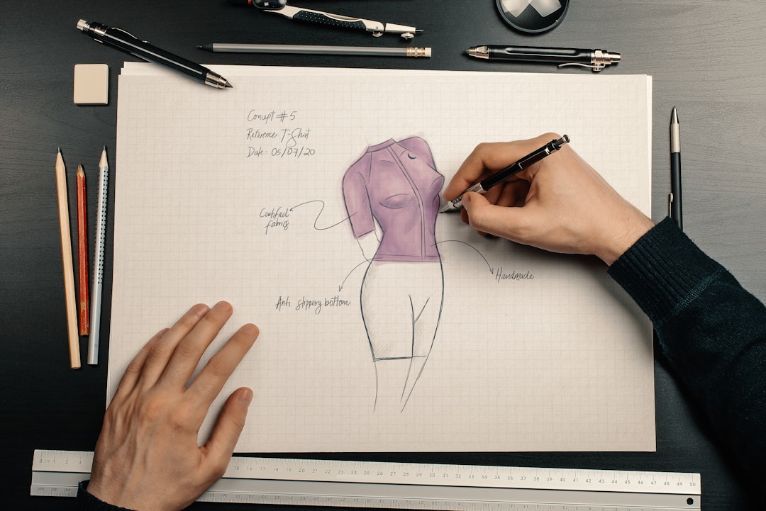
Put this into motion with a simple planning session. Lay out your capsule on paper or a digital board and assign color roles: bottoms, tops, layers, shoes, accessories. Add values (light/mid/dark) and undertones (warm/cool/neutral) next to each item. From there, draft seven outfits that cover your next week. Use high-contrast days (presentations, client meetings) and low-contrast days (errands, travel) as prompts to ensure variety.
A sample 7-day map could look like this:
- Day 1: charcoal trousers + cream tee + navy blazer + charcoal boots + berry scarf.
- Day 2: dark denim + stone knit + camel coat + tan loafers + tan belt.
- Day 3: mushroom skirt + ivory blouse + stone cardigan + tan loafers + gold jewelry.
- Day 4: charcoal trousers + berry tee + camel coat + charcoal boots + burgundy bag.
- Day 5: dark denim + cream tee + navy blazer + tan loafers + silver jewelry.
- Day 6: mushroom skirt + stone knit + stone cardigan + tan belt + charcoal boots.
- Day 7: dark denim + icy pink tee (if cool-leaning) or coral tee (if warm-leaning) + camel coat + tan loafers.
As you refine the map, check for reuse of neutrals and repetition of accents. That repetition is by design; it creates a signature. For more outfit-building ideas grounded in the same palette approach, explore our Fashion Matching hub at myfashionsecrets.com/fashion-matching. Use it to gather silhouettes that suit you, then filter them through the color rules you drafted here.
From shopping to wardrobe edits: using color to guide decisions
When you shop, treat color like a criterion, not an afterthought. Ask whether a prospective item repeats one of your neutrals, supports an accent, or bridges undertones. If the answer is no, consider skipping it—especially if you already own a strong base. Similarly, when editing your closet, remove items that never collaborate: pieces that fight your palette, introduce odd undertones, or break proportions when paired with favorites.
Set a seasonal review where you test combinations you haven’t tried yet and note what you reach for most. If a particular neutral dominates (e.g., navy), consider echoing it in shoes and accessories for extra cohesion. If an accent feels underused, it may need more allies (a scarf and a tee) or a shift to a different tone (teal instead of emerald, berry instead of magenta). The goal is not perfection but clarity: you want your clothes to support your routine, reflect your taste, and mix without much thinking.
Color-led decisions have a compounding effect. Over a few months, you’ll notice more usable outfits, faster morning routines, and fewer impulse buys that sit unworn. Your capsule will feel like yours—recognizable, consistent, and flexible—because the palette keeps telling the same story in many chapters.
- Shop with a palette checklist to filter options.
- Edit pieces that resist your undertones or values.
- Review seasonally; tweak accents rather than rebuild neutrals.
Putting it all together without overthinking
If color planning feels abstract, start small. Choose one outfit you like and decode it: identify its neutrals, value contrast, undertones, and any accent. Then build two more outfits that share those neutrals but swap top/bottom roles or change layer textures. You’ll experience how repetition creates variety. Next, add a single accent across a tee and a scarf. By day three or four, you’ll see the pattern: fewer decisions, cleaner outfits, and more room for personal details like jewelry, glasses, or hair accessories.
Capsule wardrobe color matching rewards consistency and small course corrections. Try a hue, wear it, notice what works, and adjust. Keep your palette visible—on a note in your phone, a card in your closet, or a mood board—and bring every new purchase back to that reference. Over time, you’ll establish a signature look that adapts to seasons, work demands, travel, and weekend plans without feeling repetitive. That is the quiet, practical magic of color in a capsule: it lets your clothes cooperate so you can focus on the day ahead.
Use the frameworks above to continue refining your palette, and revisit the sections on proportion and accessories whenever a combination stalls. With a few reliable neutrals, two supportive accents, and an eye for undertones, your capsule becomes a friendly system—easy to maintain, easy to expand, and ready for daily wear.