Color decisions shape every outfit you wear, and this fashion color matching guide is designed to make those decisions easier. Think of it as a friendly playbook: plain-English advice, repeatable steps, and small wins that add up to a wardrobe you enjoy. Whether you love head-to-toe neutrals or a bold pop of color, you’ll find practical tactics here that fit your routine. If you want more inspiration, explore articles at My Fashion Secrets and return to this guide when you need a dependable framework.
fashion color matching guide: the foundation of great outfits
Color is the fast lane to visual coherence. Before you buy or pair anything, make a simple plan. Start by choosing a primary palette for your everyday looks: a few neutrals for the backbone and two to three accents for interest. Neutrals create structure; accents create personality. When the palette is set, most outfits “click” without effort because everything shares common tones.
How do you pick those tones? Use two filters. First, lifestyle: colors should match the settings you dress for most. If your week is mostly office plus casual dinners, emphasize streamlined neutrals and one sophisticated accent. If your schedule leans creative or outdoors, include richer textures and earthier hues that play well with denim, canvas, and knits. Second, comfort: choose shades you genuinely enjoy wearing. Confidence shows in the way you move, and color is part of that comfort.
Next, anchor every outfit with one of your palette’s neutrals. Then add a single accent or a micro trio (accent color plus two supporting accessories). When in doubt, reduce the number of colors rather than adding more. Fewer tones usually read more polished, especially in mixed textures. Finally, keep a snapshot of your palette on your phone. Use it as a reference when shopping or styling; it prevents impulse choices that fight your closet’s harmony.
Build a capsule palette around versatile neutrals
Neutrals are the scaffolding of a working wardrobe. They ground prints, calm brights, and turn combinations into outfits. Focus on a tight set of three to five neutrals, chosen with care for fabric and undertone. Common winners include black, charcoal, navy, cream, camel, stone, and olive. The trick is not just the hue but the temperature and depth: cool charcoal versus warm brown, crisp optic white versus mellow cream.
Try this two-step exercise. First, audit what you already own. Lay pieces on a bed or rack and note which neutrals dominate. If most of your staples are black and white, your “core” might be monochrome plus one softer option like grey or taupe. If your closet skews earthy—olive chinos, tan trench, indigo denim—lean into those and add cream or stone for contrast. Second, test pairings. Put garments next to each other under daylight and warm indoor light. Fabrics change character under different bulbs; navy can look almost black at night and vivid by day. If two neutrals clash in store lighting, they will likely clash at home, too.
Designate one dark neutral for trousers and outerwear (slimming, forgiving, practical), one mid-tone for knitwear and tops (adds depth without heaviness), and one light neutral for shirts, tees, and layers (lifts the look). With three reliable categories, you can rotate combinations without thinking. Neutrals also help you “contain” stronger accents: a bright scarf or statement shoe looks intentional when the rest of the outfit sits on a calm neutral base.
Choose undertones and simple seasonal palettes without the jargon
Undertones decide whether colors feel harmonious or uneasy. You don’t need complicated analysis to get them right. Use a quick rule: observe whether a color leans warm (yellow/red base) or cool (blue base). Then match neighboring items by temperature or by contrast with intention. Warm camel pairs smoothly with brick, rust, and cream. Cool navy pairs smoothly with grey, slate, and optic white. Cross mixing is possible—navy with camel or rust—but the rest of the outfit should help those opposites meet, often via a bridging neutral like cream or stone.
For seasons, think use-case rather than strict labels. Build mini palettes you can swap through the year. For spring, try cream, stone, light blue, and a fresh green accent. For summer, anchor with white, navy, and tan, add coral or cobalt. For autumn, lean into camel, olive, chocolate, and rust accents. For winter, emphasize black, charcoal, rich navy, and jewel accents like emerald or burgundy. These are guides, not rules; your climate and habits matter more than any chart. If you travel between climates, create a portable mini palette that mirrors your home base so you can combine pieces easily.
The fastest way to see undertones is to compare near-neighbor colors side by side. Put a cream blouse next to a pure white tee; one will look warmer or cooler instantly. Do the same with two navy items: if one feels “ink” and the other “denim,” they may live on different sides of the cool spectrum. Over time, your eye learns these micro differences, and matching becomes intuitive.
Ten dependable color combinations (with real-world examples)
When time is short, reach for dependable combos that work across settings. Here are ten that fit most wardrobes:
- Navy + White + Tan: crisp, maritime, and easy to dress up or down. Navy blazer, white tee, tan loafers.
- Black + Grey + White: streamlined and modern. Charcoal trousers, white shirt, black boots.
- Camel + Cream + Chocolate: soft, elegant warmth. Camel coat, cream knit, chocolate belt.
- Olive + Stone + Denim: relaxed utility. Olive jacket, stone tee, indigo jeans.
- Charcoal + Burgundy + Black: weekday sophistication. Charcoal suit, burgundy knit, black oxford shoes.
- Beige + Cobalt + White: a clean pop of color. Beige slacks, cobalt top, white sneakers.
- Tan + Rust + Cream: autumn-friendly. Tan boots, rust scarf, cream sweater.
- Black + Emerald + Silver: evening polish. Black dress, emerald earrings, silver clutch.
- Grey + Blush + White: gentle and versatile. Grey blazer, blush blouse, white jeans.
- Navy + Camel + Stripe: subtle pattern lift. Navy trousers, camel cardigan, striped tee.
Use these combos as repeatable templates. Swap pieces within the trio while keeping proportions similar, and you’ll get new looks with minimal effort. If a combination feels flat, adjust texture: a ribbed knit, suede boot, or crisp poplin can add dimension without adding more color.
Smart print and pattern coordination without visual noise
Prints are fun, but they can overwhelm if you mix too many unrelated colors. Keep pattern pairing simple with two rules. First, choose one “lead” print and treat the rest of the outfit as supporting cast. Lead prints might be stripes, checks, florals, or abstract motifs. Second, echo a color from the print in a solid piece. For a navy-and-cream stripe tee, choose navy trousers or a cream cardigan. For a floral skirt with blush and green, echo blush in the top or green in the accessories.
Scale also matters. Pair one larger-scale print with a smaller-scale companion or a solid to maintain balance. Stripes often behave like a neutral because they are structured and familiar. Checks and houndstooth carry tradition and look refined when grounded by plain pieces. If you want to mix two prints, keep them in the same color family and adjust the scale: small stripe with medium floral, or micro check with big polka dot.
Texture can stand in for pattern. A cable-knit sweater, a quilted jacket, or a pleated skirt adds visual interest without introducing new colors. If you feel tempted to add another print, try textured solids first. You may find the outfit looks richer yet calmer, especially in office and dinner settings where subtlety reads more polished.
Fabrics, texture, and light: why the same color can look different
A color is not just a hex code; fabric, weave, and light change its personality. Matte cotton shows color plainly. Silk or satin adds sheen, making the hue look brighter. Wool and cashmere soften edges and slightly mute saturation. Denim introduces white threads that lighten the overall perception. That’s why a “navy” shirt can look different from a “navy” blazer—they live in different textures under different lights.
Use this to your advantage. If a color feels too bold, choose it in a matte fabric or a small accessory. If a neutral looks dull, pick a richer texture: ribbed knit, subtle sheen, or slight slub. When mixing similar colors across fabrics, check them in daylight and indoor light. Carry a small piece from home—a scarf, belt, or swatch—and hold it against a potential purchase. If the undertones agree, the pairing will look coherent. If they disagree, you’ll see a faint “buzzing” effect where the colors resist each other.
Consider edge contrast—the line where two colors meet. High contrast (black next to white) creates drama and sharpness. Low contrast (stone next to cream) creates softness and flow. Pick contrast based on the mood you want and the setting. High contrast suits structured looks and evening; low contrast suits daytime softness and layered outfits.
Accessories, footwear, and bags: small color layers, big impact
Accessories are your fastest color tools. Belts, shoes, bags, scarves, hats, jewelry, and watches shift the mood of an outfit without changing the core garments. The simplest approach is to pick one accent color from your palette and repeat it twice in small ways. Example: cobalt scarf and cobalt earrings with a navy-and-cream base. Two touches signal intention without shouting.
Footwear can anchor or lift the palette. Black boots ground an outfit and add formality. White sneakers lighten and modernize. Tan loafers introduce warmth and bridge camel, cream, and denim. Metallics—gold, silver, pewter—act as flexible neutrals and play nicely with both cool and warm palettes. Bags follow similar logic: a camel tote warms; a black structured bag sharpens; a cream crossbody brightens. If you enjoy bold bags, keep shoes neutral to avoid visual competition at the two ends of your silhouette.
Jewelry deserves a quick plan. If your palette leans warm, gold and brass harmonize with camel, rust, and cream. If your palette leans cool, silver and stainless steel support navy, grey, and jewel tones. Mixed metals can work, especially when your outfit includes both warm and cool elements, but repeat one metal twice for cohesion. Watches, rings, and a single necklace often read more refined than stacking every piece you own.
Beauty cues that support outfits: nails, lipstick shades, and hair tonality
Beauty choices are color choices too. Nails, lipstick, and hair tonality can echo or soften your outfit. If you favor minimal looks, a muted nail (taupe, nude, soft pink) blends across outfits, while a classic red nail becomes a consistent accent. Lipstick can be treated like an accessory. On days with a bright scarf or bold shoe, a neutral lip keeps balance. When your clothes are neutral-heavy, a berry or brick lip adds dimension.
Hair color and highlights contribute undertones to the overall palette. Ashier tones lean cool; honey or copper lean warm. You don’t need to overhaul anything—just notice how certain clothing colors harmonize with your hair and choose accordingly. For example, charcoal and emerald tend to love ash brown; camel and cream flatter honey highlights. If you add a new accent color to your wardrobe, try a test day with supportive beauty choices and see how the entire look feels.
Fragrance is invisible color—a mood note, essentially. Fresh citrus reads bright and crisp, woods read warm and grounded, florals read soft and romantic. Matching the fragrance to the vibe of your colors can make the outfit feel coherent from head to toe, even though no one sees scent.
Care and storage strategies to keep colors looking fresh
Good care routines help colors look their best. Read fabric tags, but more importantly, learn how the fabric behaves in your home (machine type, water hardness, and drying setup vary). Wash brights with brights, darks with darks, and lights with lights. Turn denim and printed pieces inside out to help reduce visible fading and friction on the surface. Use mesh bags for delicate items so hardware and zippers don’t abrade smoother fabrics.
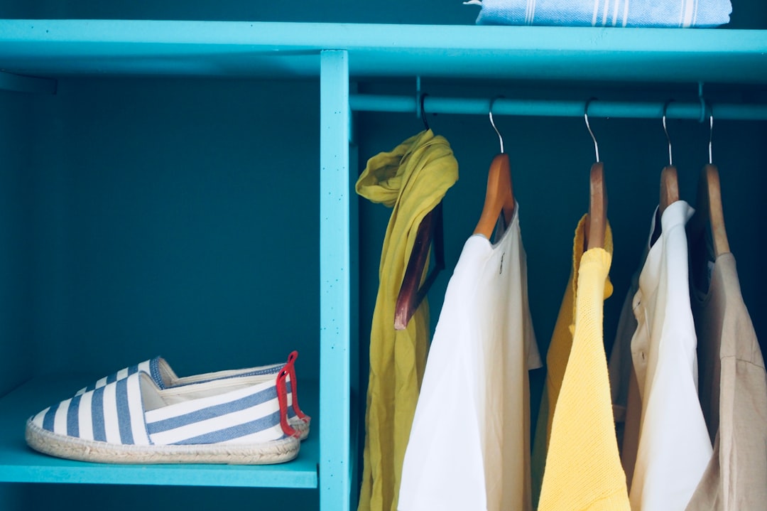
Air-dry when possible, especially for knits and pieces with elastane. Heat can dull surface sheen and alter fabric texture. If you hang knits, use wide hangers or lay them flat so weight doesn’t stretch the shoulders. For storage, group items by color family. That makes morning pairing faster and keeps your palette visible at a glance. Keep sun exposure low; direct light on one part of the closet can shift color over months. A simple curtain, tinted window film, or repositioned rack may help.
Spot-care is often enough. If you encounter a small mark, treat it promptly with gentle methods suited to the fabric, then test on an inside seam first. The goal is not perfection but steady maintenance. Over-cleaning can tire garments; measured care preserves color and life.
Shopping tactics: swatches, lighting, and proportion planning
Shopping confidently is about preparation. Bring a small “kit”: photos of your palette, a neutral scarf or tee, and a note with your current gaps (e.g., “need tan loafers; olive jacket replacement”). Try items under different lights: near a window, under cool LEDs, and under warm halogens. If the color shifts too much between zones, consider a different shade or fabric. Ask to step outside if permitted; daylight reveals undertones better than showroom bulbs.
Buy in proportion to use. If you wear neutrals five days a week, allocate most of your budget to excellent neutral staples—trousers, knitwear, coats. Then add one accent hero per season: a scarf, shoe, or bag that instantly updates your base. When evaluating prints, count the colors in them; prints with three or fewer hues are generally easier to integrate than multi-color prints.
Return policy is part of color strategy. Take pieces home and pair them with what you own. A color that felt perfect in-store might argue with your neutrals at home. Your closet is the final judge. If an item fails the at-home test, return it and wait for the shade that truly harmonizes.
Travel capsules: compact color systems for trips
Travel simplifies decision-making when you build a compact color system. Choose two neutrals (one dark, one light) and one accent that can be echoed easily in accessories. For example: navy, white, and coral; or black, cream, and emerald. Pack pieces that interlock—every top should match every bottom and layer. A striped tee often acts as a flexible link, tying your neutrals and accent together across multiple outfits.
Footwear follows the same logic. Bring one pair that grounds (black boots or tan loafers) and one that lightens (white sneakers or metallic flats). Add a small accessory set in your accent color: scarf, earrings, and a slim belt. These micro repeats make hotel-room dressing quick and consistent whether you’re meeting coworkers or exploring a new neighborhood.
For unpredictable weather, let texture and light layers do the work. A compact knit in a mid-tone neutral can bridge a breezy blouse and a heavier coat. Choose a travel bag color that complements both the dark and light neutral so it doesn’t clash in photos. With the capsule assembled, daily color choices become easy enough to do while you’re still on local time.
Troubleshooting mismatches and quick rescue tactics
Even pros run into mismatches. The fix usually involves either reducing noise or adding a bridge. If two colors argue, swap one piece for a neutral and reintroduce the accent elsewhere at a smaller scale. Example: if a bright blouse fights with trousers, change the trousers to navy and echo the blouse color in earrings or a lip shade. If a print feels too busy, remove the competing accent and support it with solid textures.
Bridging colors solve many problems. Cream bridges black and camel. Stone bridges olive and grey. Denim bridges nearly everything. When you hit a wall, ask: “What neutral could sit between these two colors?” Try that neutral in a belt, shoe, or layer. Also consider sheen: a matte accessory can calm a shiny top; a subtle sheen (like a satin scarf) can lift matte knits.
If you’ve bought an item that doesn’t play well with your palette, decide whether it’s a standalone piece for occasional use or a candidate for alteration. Tailoring can shift silhouette and make color feel more intentional. If the item is a near-miss in shade, consider small dye services or swapping buttons and trims to better match your neutrals. Your goal isn’t to salvage every purchase; it’s to keep the closet harmonious and easy to style.
Using accent colors with confidence (and restraint)
Accents bring personality, but restraint makes them powerful. Choose one or two signature accents for a season. Repeat them in small ways—earrings, scarf edge, shoe trim—so they look like part of your identity rather than a random choice. If you love bright red, consider a red nail, a slim belt, or a stripe in a tee instead of head-to-toe red. If you favor cobalt, use it in one garment plus one accessory on days when you want extra energy.
Rotate accents when you crave variety. A closet with one or two accents per season stays fresh without turning chaotic. When introducing a new accent, do a trial week: three outfits using the accent lightly. If the color genuinely pleases you and works with your neutrals, promote it to signature status. If it fights too often, let it go and refine the palette you already love.
The safest accessory accents are near your face (earrings, scarves) and at your feet (shoes). They create a vertical echo that reads cohesive on the body. Keep bags flexible—camel, black, cream, or metallic—and swap straps if you want an accent hint without purchasing another bag.
Proportions, silhouettes, and how color shapes the outline
Color influences silhouette the way shadow influences shape. Darker tones recede; lighter tones advance. Use this to balance proportions. If you want to lengthen the leg line, wear darker trousers and lighter tops with slight contrast in the shoes. If you want to widen the shoulder or add structure up top, use darker tones at the shoulder (e.g., a black blazer) and lighter mid-tones below.
Vertical color lines shape how the eye travels. A long darker coat over lighter inner layers creates a “frame” that elongates. A lighter scarf or necklace draws the eye to the face. Horizontal breaks (color blocks at the waist or hem) add energy but can shorten; adjust where the break happens depending on your preference for proportions. Monochrome outfits remove breaks entirely, letting texture and sheen do the work instead.
Experiment by taking quick mirror photos from a few paces back. You’ll see how a color line operates across the whole outline rather than just close-up. When a silhouette feels off, move color rather than replacing the entire outfit: swap the shoe shade, add a belt, change the top’s undertone. Small changes often restore balance.
Building habit loops so color choices become effortless
A wardrobe works best when you make a few decisions once and reuse them often. Build a habit loop for color. On Sunday, pick five outfits using your capsule palette and accents. Place pieces together on hangers or shelves. Each morning, put on one without making new color decisions. After a week, note which combinations you reached for most, which felt best in your settings, and which required tweaking.
Update your palette quarterly with a small check-in. Keep neutrals stable unless you notice persistent clashes or a lifestyle shift (e.g., new job, different climate). Rotate accent colors seasonally to satisfy variety without rebuilding from scratch. Maintain a short “color journal” in your phone—photos of successful outfits, color notes, and a wish list. When you shop, compare potential purchases to that journal rather than buying in isolation.
When friends ask how you always look put-together, it usually comes down to this loop: a compact palette, pre-decided combos, and regular maintenance. It’s not about owning more pieces; it’s about owning colors that cooperate. If you want more structured inspiration, browse the fashion matching stories on myfashionsecrets.com and remix ideas into your routine.
Putting it all together: one palette, many outfits
Imagine a capsule of navy, cream, camel, and emerald accents. Your base is navy trousers, cream blouse, camel coat. Day one: add emerald earrings and a cream shoe. Day two: swap blouse for a navy knit and add a stripe tee beneath for a peek of cream; keep earrings small and add a camel scarf. Day three: cream jeans, navy tee, camel cardigan, emerald nail and slim belt. Day four: navy dress, camel tote, cream flats, small emerald stud. Day five: navy blazer, cream tee, camel trousers, emerald pendant.
The colors stay the same; the outfits feel different because proportions, textures, and accents shift. After a week, the capsule proves itself: you used a few reliable tones and two consistent accent cues to create variety without chaos. That is the essence of this guide—make color a system, not a series of one-off decisions.
As you refine your palette, keep reminding yourself that color matching is personal. There’s no single correct answer. You’re building a set of rules that serve your life, your taste, and your calendar. With a small set of neutrals, two or three accents, and a handful of rescue tactics, you’ll find that getting dressed becomes calmer, faster, and more enjoyable. And when you want new ideas, revisit this fashion color matching guide and adapt it to whatever your next season brings.