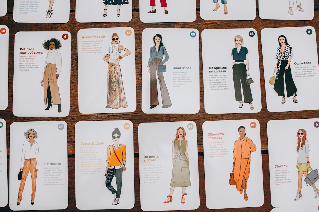
If you’ve ever stood in front of a closet full of clothes and felt you had nothing to wear, capsule wardrobe color matching is the habit that brings order to the chaos. The idea isn’t about owning the fewest items possible. It’s about choosing colors that belong together so every top, bottom, layer, and shoe has multiple partners. In this guide, you’ll learn a straightforward framework that reduces decision fatigue, makes shopping easier, and helps each piece earn its keep. You’ll build a base palette, add accents, handle prints and textures, and move smoothly through the seasons without starting over each time.
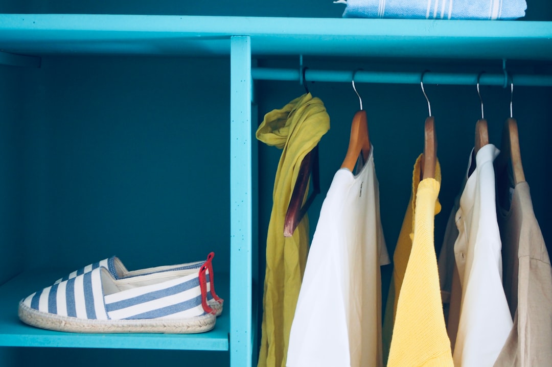
One note before we begin: personal style is personal. The steps here are practical patterns, not rigid rules. Try the exercises, note what feels like you, and adjust as you learn. If you want a continual stream of inspiration, bookmark our home page at My Fashion Secrets and return when you need fresh ideas.
What capsule wardrobe color matching actually means
A capsule wardrobe works because the colors inside it cooperate. When your clothes share a visual language, every morning feels simpler. You stop wrestling with odd pieces that only work with one item, and you stop buying duplicates because nothing seems to match. Instead, you begin from a repeatable core that supports a wide range of outfits, then layer on accents for interest. The result looks consistent without being predictable.
In practice, color matching inside a capsule means three things:
- You identify your base neutrals that anchor most outfits. These are the workhorses: think navy, charcoal, black, tan, cream, or gray.
- You select a small set of accent colors that play nicely with those neutrals and with each other. These show up in tops, scarves, shoes, bags, and the occasional statement layer.
- You use simple proportions—more base, fewer accents—so your closet feels cohesive instead of loud.
There’s a financial angle too. When your palette is defined, impulse buys lose their charm because you instantly notice when a color won’t pull its weight. You naturally consider cost-per-wear and gravitate toward pieces that fit the system. Over time, getting dressed takes less time and money while your outfits look more considered.
Capsule wardrobe color matching framework
Here’s a framework that’s simple enough to memorize and flexible enough to adapt to different lifestyles and climates.
The 3–2–1 Palette Rule:
- 3 base neutrals you truly love and will wear often (for example: navy, gray, cream).
- 2 accent colors that add interest and reflect your mood or setting (for example: forest green and rust).
- 1 wildcard for special pieces or seasonal experiments (maybe a bold cobalt or a soft lilac).
Pair that with a straightforward proportion guideline—60/30/10—to keep your outfits balanced:
- 60 percent base neutrals dominate your closet and most outfits.
- 30 percent secondary neutrals or subtle accents support the base.
- 10 percent bright accents or the wildcard color add spark.
Try these sample combinations to see how the rule comes alive:
- Cool undertones example: base neutrals navy, charcoal, and soft gray; accents deep green and burgundy; wildcard cobalt.
- Warm undertones example: base neutrals camel, cream, and warm brown; accents terracotta and olive; wildcard mustard.
- Soft minimal example: base neutrals stone, ivory, and sand; accents dusty blue and blush; wildcard lilac.
Don’t worry about picking the perfect palette forever. You can shift accents as your tastes evolve, while the neutrals provide continuity. The goal is a system that survives the urge of the moment and supports daily life—workdays, weekends, and evenings—without fuss.
Building your base palette
Your neutrals do most of the heavy lifting, so pick them with care. Start with what you already own and actually wear. Lay items on a bed or rail and notice which colors recur and which items get the most use. This audit usually reveals two or three neutrals that deserve promotion to your core palette.
Check your undertone. Stand near a window and look at the inside of your wrist or hold a white sheet near your face. If blue or pink notes feel harmonious, you may lean cool; if gold or peach feels right, you may lean warm. This isn’t an exam—use it as a nudge, not a verdict. Cool-leaning neutrals include charcoal, navy, and icy gray. Warm-leaning neutrals include camel, cream, taupe, and chocolate. Many people blend both by choosing one cool and one warm neutral and then minding the proportion (for instance, 60 percent cool, 30 percent warm).
Choose fabric textures that play nicely together. Even if your colors match, clashing textures can make outfits feel disjointed. Pair matte cotton tees with polished wool trousers, or soft knit cardigans with crisp denim. Keep at least one smooth neutral (e.g., polished wool or structured cotton) and one textured neutral (e.g., rib knit, tweed, bouclé) in your base; this gives depth to monochrome looks.
Confirm the workhorse categories. You’ll likely wear neutral trousers, denim, layering blazers or cardigans, and a coat or trench most. Make sure each of these exists in one of your base neutrals, and that their shades coordinate. A navy coat, charcoal trousers, and cream knit create countless combinations across seasons. Once base pieces align, nearly any top in your closet finds a partner.
Accent colors that fit your lifestyle
Accents inject personality. They should feel like you on a good day—energized, curious, or calm—depending on your setting. The trick is choosing accents that harmonize with your neutrals and with each other so they don’t fight for attention.
Pick two accents that serve different roles. One can be energizing (for example, cobalt, coral, or emerald), the other calming (dusty blue, sage, or mauve). Imagine your week: which days or events crave a lift, and which call for quiet? Let the accents support those moods instead of competing.
Test accents in accessories first. Before committing to a bright sweater or coat, try the color in a scarf, bag, belt, or pair of shoes. Accessories sit at smaller proportions in an outfit, making them safe trials. If you reach for the accessory often, you’ll likely wear a larger piece in that color too.
Build accent clusters so each accent has two or three supporting items. If your accent is emerald, you might have a silk scarf, a knit, and a crossbody bag in similar tones. That way, the accent shows up in different contexts, and when one item is in the laundry, the color story continues.
Choose accents that echo your environment. If you spend lots of time in formal offices, deeper accents (wine, forest, navy) blend smoothly. If your lifestyle leans relaxed, lighter accents (sage, sky, blush) stay easy. For evening events, metallic accents—gold for warm palettes, silver for cool, mixed metal for eclectic—quietly complement almost everything.
Seasonal transitions: spring, summer, fall, winter
Seasonal shifts are where a capsule proves its value. Instead of reinventing your closet, you adapt fabric weight, layer order, and accent temperature.
Spring adds freshness. Keep your base neutrals, lighten the fabric weight, and introduce one brighter accent. A cream cardigan, light-wash denim, and a sky-blue scarf look seasonally right without breaking your system. Patterns with white space—thin stripes, micro florals—read lighter while still aligning with your base.
Summer is about breathability and simplicity. Lean into lighter neutrals (ivory, stone, light gray) and keep accents airy (coral, seafoam, pale blue). Outfits shrink in layers, so proportion matters even more. A stone linen short, ivory tank, and coral slide sandal hit the 60/30/10 balance neatly.
Fall warms the palette. If your base includes camel or chocolate, bring those forward. Consider terracotta, rust, or olive accents to echo seasonal colors. Swap smooth textures for cozier knits, corduroy, and suede. Because fall outfits stack more layers, keep accents restrained; one accent color in a look is often enough, especially with a patterned scarf or textured coat.
Winter deepens the base. Navy, charcoal, and black become anchors. Accents can go richer (burgundy, emerald) or icy (cobalt, frosted lilac) depending on your undertone and mood. Frequent layering means your wildcard can reappear as a statement coat or bold knit, but let the rest of the outfit stay neutral to avoid visual noise.
Neutrals done right: black, navy, cream, gray, tan
Each neutral has strengths. Knowing when and how to lean into them keeps outfits fresh.
Black is sleek and serious. It’s powerful in tailored pieces—trousers, blazers, coats—and shines at night. Black can cool or flatten softer complexions, so consider pairing it with textured knits, a cream tee at the neckline, or a bright lip to soften the effect.
Navy is forgiving and versatile. Navy partners easily with both cool accents (emerald, cobalt) and warm ones (camel, rust). It’s excellent for officewear and casual layers alike. A navy blazer over a gray column (tee plus trousers) gives a long line without looking stark.
Cream/ivory introduces light. Cream glows in summer linen and brightens winter knits. It also softens heavier textures—try a cream fisherman sweater with dark denim—keeping outfits from feeling heavy. If you fear stains, reserve cream for tops, scarves, or layers you can remove, and choose machine-washable fabrics to keep care realistic.
Gray is the chameleon. Light gray communicates softness; charcoal feels urban and modern. Gray makes a terrific base for experimenting with accent colors because it rarely clashes. If your gray reads too cool for your complexion, add warm accessories (tan belt, warm-toned scarf) to bridge the gap.
Tan/camel adds warmth and polish. Camel-coats and tan boots carry an outfit with minimal effort. If tan near your face dulls your features, keep it to outer layers and bottoms, or mix it with cream, white, or navy to keep the look lively.
Patterns and textures without clashing
Patterns and textures add depth, but they need to speak the same language. The easiest way to avoid chaos is to limit one statement per outfit: one bold pattern or one highly textured piece, then keep the rest calm.
Scale matters. Combine different pattern scales so they don’t compete—micro stripes with medium checks, or a small houndstooth with a larger floral. Matching scales (two big patterns) often fight for attention. If you love a bold pattern, let it be the only accent and surround it with neutrals.
Stick to your palette. Even busy patterns look intentional when the colors are already in your capsule. A navy-and-cream stripe, a black-and-tan check, or a burgundy plaid will sit naturally with your base. If a pattern includes your accent color, treat it as a substitute for wearing that accent in a solid piece.
Texture is a quiet pattern. Bouclé jackets, cable knits, suede shoes, glossy leather, raw denim—each adds visual interest. Mix matte and shine: a matte tee with a satin skirt, or a ribbed cardigan over a smooth dress. Keep the color simple when the texture speaks loudly so the outfit stays cohesive.
Outfit formulas for work, weekend, and evenings
Formulas simplify dressing by turning your palette into ready-made templates. Here are dependable combinations that respect the 60/30/10 balance.
Workday column with contrast layer: build a column of one neutral (charcoal tee and trousers), then add a contrast third piece (navy blazer). Finish with neutral shoes and a subtle accent (deep green belt or bag). The long line flatters most bodies and looks refined without trying.
Weekend denim plus soft knit: choose base denim (mid-wash or dark depending on your palette), add a cream or gray knit, and complete with an accent sneaker or scarf. If temperatures drop, toss on a camel or navy coat. This lands casual but polished.
Evening minimal shine: use a sleek base (black or navy dress or matching separates), add limited shine (metallic clutch, satin shoe), and keep jewelry coordinated to your metal tone of choice. A single accent—burgundy lip, emerald earring—keeps focus where you intend.
Monochrome with texture: dress head to toe in one neutral (all-gray, all-cream) and introduce interest through texture shifts (smooth trouser, ribbed knit, suede boot). Because the color is unified, the outfit looks composed rather than busy.
Casual layers triangle: tee in neutral, overshirt or cardigan in secondary neutral, outer layer in primary neutral, with an accent shoe or scarf. The three-layer triangle offers depth while remaining within your palette.
Accessories as color translators
Accessories connect colors that might otherwise feel unrelated, acting as translators between pieces. They also allow low-stakes experiments with new accents.
Bags and belts can echo accent colors or bridge neutrals. A tan belt and bag warm an otherwise cool outfit; a navy bag cools a warm one. If you keep hardware consistent (all gold, all silver, or a deliberate mix), your accessories feel like a family rather than one-off purchases.
Shoes influence formality and palette at once. Neutral shoes in your base colors are the most wearable; an accent shoe works best when it appears elsewhere too (a scarf, a bag). White or cream sneakers brighten casual looks across seasons.
Scarves and hats are proportionally small but visually strong. A scarf that contains both a neutral and your chosen accent instantly ties an outfit together. Patterned scarves that include two or three of your palette colors function like a shortcut to cohesion.
Jewelry aligns with undertone. Gold complements warm palettes; silver complements cool; rose gold sits softly between. If you like to mix metals, repeat the mix at least twice—say, a mixed chain and a belt with mixed hardware—so it looks purposeful.
Beauty choices can reinforce your palette. A muted berry lip for cool palettes or a warm terracotta for warm ones harmonizes without shouting. Nail colors in neutrals or accent shades add subtle continuity.
Laundry, care, and longevity for colors
Clothing care habits can support your palette by keeping colors looking new and consistent longer. The goal isn’t perfection—it’s building routines that fit your life and keep pieces wearable.
Sort smart. Wash deep and light colors separately to help reduce color transfer. Use cool water for darks and mid-tones, and a gentle cycle for knits. Turning garments inside out may help reduce visible fading on the outside.
Use mild detergents designed for colors, and dose thoughtfully. More soap doesn’t mean cleaner clothes; it can leave residue that dulls fabric. When possible, air dry knits flat to help maintain shape and minimize wear on fibers.
Mind friction. Denim and structured cottons can rub against softer fabrics. Launder similar weights together or use mesh bags for delicate items. Store knits folded rather than hanging to avoid stretching and shoulder bumps.
Refresh, don’t over-wash. Many pieces benefit from airing out between wears. Steaming relaxes fibers and can release wrinkles, helping a garment look fresher without another wash cycle.
Shopping checklist and budgeting tips
A color plan changes how you shop. Instead of chasing novelty, you look for pieces that complete outfits you can already imagine. Here’s a practical checklist and a simple budgeting approach.
Pre-shop audit:
- List your base neutrals and two accents. Keep the list in your phone for reference.
- Note categories where you lack good options (e.g., “need navy trousers,” “replace cream knit”).
- Identify a wildcard for the season so experiments stay contained.
In-store or online filter:
- Does the color belong to your palette? If not, skip.
- Can you build three outfits from your closet with this piece right now?
- Does the fabric align with your season and care habits?
Budget with cost-per-wear in mind. Estimate how many times you’ll reasonably wear the item in the next year. Divide the price by that number. If the cost-per-wear is comfortable and the color integrates seamlessly, the purchase is likely to serve you well.
Quality cues: check stitching, seams, buttons, and zippers. Quality fabric and neat construction outlast trend pieces. When thrifting, bring your palette list and scan for your neutrals first; finding a well-made coat in your base color can upgrade dozens of outfits.
Common mistakes and gentle fixes
Everyone learns by doing. If your closet feels scattered, you’re not alone. These common missteps have simple fixes.
Too many accents, not enough base. If every top is bright, nothing feels harmonious. Solution: pause accent purchases and add two or three base pieces (trousers, skirts, cardigans) in your primary neutral. Suddenly, existing accents will find partners.
Ignoring undertones. A beautiful camel coat may clash with a cool-heavy wardrobe. Fix by bridging with a cream scarf, or let the camel live as an accent while you keep most layers cool. Over time, you’ll notice which temperature range feels most “you.”
Buying what you like, not what you’ll wear. It’s easy to fall for a stunning piece that doesn’t fit daily life. Try a “24-hour rule”: if you can’t name three outfits and at least two occasions, wait a day. If it still works in your plan, get it; otherwise, you just saved your budget.
Pattern overload. Two large patterns in one outfit often compete. Limit to one feature pattern and keep the rest neutral or micro-scale. If you adore patterns, keep them within your palette so they harmonize.
Sample 10-day lookbook plan
Use this plan to stress-test your palette. It assumes base neutrals of navy, gray, and cream, with accents of emerald and burgundy. Swap in your own colors while following the same logic.
- Day 1: Gray tee + gray trousers (column), navy blazer, emerald belt, cream sneakers.
- Day 2: Cream knit + navy denim, tan belt, burgundy crossbody.
- Day 3: Navy dress, gray cardigan, silver jewelry, neutral ankle boots.
- Day 4: Gray tee, cream wide-leg pant, navy trench, striped navy/cream scarf.
- Day 5: Monochrome navy: navy tee + navy chinos, suede loafers, minimal jewelry.
- Day 6: Weekend: cream tank, light-wash denim, tan sandals, emerald tote.
- Day 7: Office: gray blouse, charcoal trousers, navy blazer, burgundy belt.
- Day 8: Evening: black or deep navy slip dress, metallic clutch, coordinated metal jewelry.
- Day 9: Travel: cream tee, navy jogger, gray hoodie, white sneakers, patterned scarf with navy and burgundy.
- Day 10: Smart casual: gray knit, navy skirt, tan belt, burgundy flats.
Notice how neutrals repeat while accents rotate. The lookbook shows your capsule is doing its job: options appear without buying more. If a day felt off, analyze which color or proportion caused the friction and adjust the palette or item list accordingly.
Putting it all together
Capsule wardrobe color matching is less about restraint and more about alignment. You decide the visual language of your closet, then shop and dress in that language consistently. Start with three neutrals you love, add two accents that reflect your life, and allow one wildcard to keep exploration alive. Use the 60/30/10 proportion, mind pattern scale and texture, and rely on accessories to connect the dots. With each small decision, you build a closet that works with you, not against you.
Whenever you need a refresher—new seasonal ideas, updated accessory tips, or lookbooks that follow this exact framework—drop back into My Fashion Secrets and keep your palette moving forward with confidence.